 The number of Coronavirus cases confirmed in Spain, but what is the true figure?
 I enjoy numbers and when I present some figures to my wife, showing a particular set that either makes the case for or against something, she laughingly says that 'you accountants can do anything with figures'. I assure you that I’m not an accountant, but I do have an affinity for the subject.
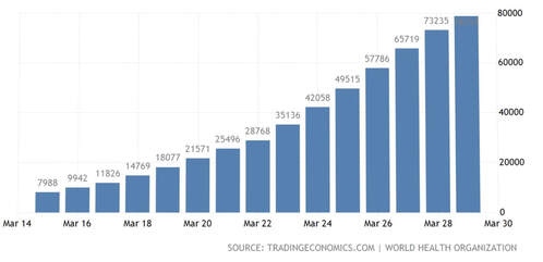
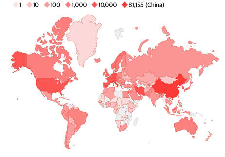
Perhaps for that reason, I’m annoyingly baffled by the numbers being bandied about relating to Coronavirus. I don’t think I’ve ever seen such confusing calculations before. There are usually three numbers given as indications of how the virus is affecting a country; the number of cases confirmed, those who have died, and those who have recovered. Comparisons are being made even though the base data is so different. If one country is only carrying out limited tests, then the percentage of deaths will appear higher than where tests are plentiful. It’s evident that a far larger number of people have, or have had, Coronavirus than the data shows. The number of people presently being tested is fewer than ideal because of a lack of testing equipment, so it’s likely that many more of the population really have the illness. Also, because health workers are repeatedly being tested, unlike the public, it shows the former group as more ill than the general population, which may not be true. Further, the deceased may only be counted as dying from the virus if they have previously been confirmed as having the illness. Elderly patients have sadly died in residential homes, never having been tested, so it’s conveniently assumed that they didn’t die of Coronavirus. Those who were tested, were likely to have had underlying health problems and the virus was not the sole reason. If they also had a chronic breathing condition, for example, would you say they died of Coronavirus or respiratory failure? Yes, confusing.
Let’s make this simpler. Imagine a class of 30 schoolchildren. If 5 of them have an English test and 4 of them pass, we could say that the pass rate was 80%. However, only 20% of the class were tested; as a class, the pass rate is therefore only 13%. It depends how you present the figures. In addition, we don’t know whether the 5 who took the test were thought to be the best at English or the worst, or whether the pupils were chosen at random. Assumptions made only from the results are unreliable if you don’t know the parameters. That’s very similar to the figures we’re presented with daily from the so-called experts of the virus.
The media keeps us up-to-date with daily numbers of infections and deaths and these can appear worrying. There’s no doubt that there are many patients worldwide and, unfortunately, some of them won’t survive. However, to put these figures into context and to compare them with the normal death rates, they aren’t so scary. As I’ve written in a previous blog post, the normal, average daily deaths in the UK is 1711, in Spain 1185 and in the US 7883. That’s every day throughout the year, every year, irrespective of whether there's a epidemic one year or not.
Personally, I’m more worried about the economic effects that the virus will have. It’s impossible to manipulate the figures to show countries benefitting from the drastic actions taken by governments around the world. We may, or may not, find that those governments were right to act as they have done - there is certainly peer pressure to do so, but what is clear is that the debts being accumulated by countries and individuals will cause terrible hardship to many and take a long time to pay off. Is a lockdown the answer to tackle the virus, or should we be taking a more relaxed approach, as they are in Sweden? Is it lives versus the economy? It’s only by presenting the numbers in a balanced way that we can begin to figure out the answer.


 RSS Feed
